SnapX Visual Branding Project
Role: Motion & Graphic Designer
Company: SnapX (Fintech Startup)
Working period: 3 weeks
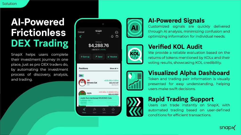
About company: SnapX helps users complete their investment journey in one place, just as pro DEX traders do, by automating the investment process of discovery, analysis, and trading.
The Marketing team of startup company SnapX approached me to help them lay the foundation for their visual branding.
The key is flexibility: a basic aesthetic that can be built on.
In terms of tasks, it came down to two components: design the visual branding and apply it to the project deck + social media templates. The logo was already designed (by Spock, who is part of the SnapX team), so I had a starting point.
Mood-boards Round 1
The team asked for three options and gave me references to work with. The references led me to divide the styles into three categories:
• 2D Patterns
• 3D
• Isometric
I went ahead and created the first mood-boards.


I visited the office in Gangnam and presented the mood boards. The Marketing Team, Business Team and CEO attended. Their feedback was the following:
Mood-board proposal #1 (2D patterns)
Too many pattern styles; request to trim it down.
Mood-board proposal #2 (3D)
Though interesting, it lacks a story. Request to specify the elements for consistency.
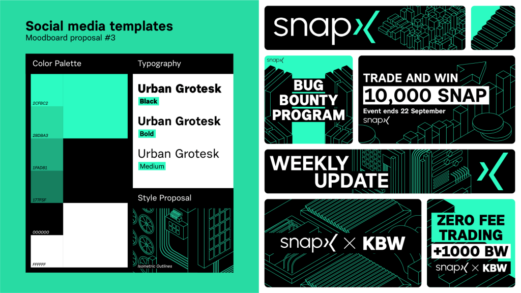
Mood-board proposal #3 (isometric)
A team member foresaw some technical issues when applying this style to the website and app.
For round 2, the teams wanted me to continue working on #1 and #2 and introduce an optional third color to the existing palette.
Mood-boards Round 2


During the second presentation, a discussion among the team members arose. The problem regarding which style to choose came down to choosing between aesthetics or practicality.
They liked the 3D style aesthetically more but feared that, with the (at the time) limited resources, it might be too difficult to implement it in their marketing efforts and product designs compared to the 2D patterns style. Another concern was, typical to Korean startups, the timeframe of delivery: fast (빨리빨리).
The 3D style is complex and takes more time to create, so the teams chose practicality.
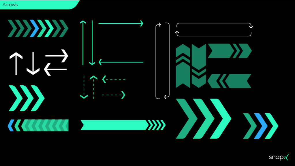
Project Deck
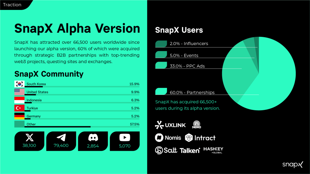
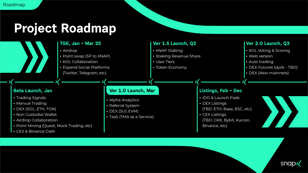
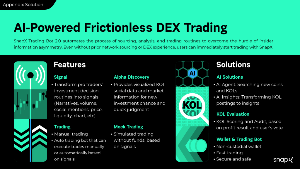
Once the visual branding style was chosen, I was tasked with creating the project deck. Out of the 23 pages, here are some highlights:

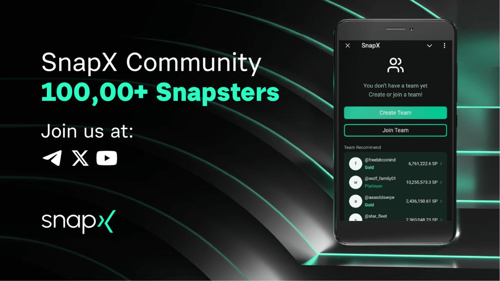
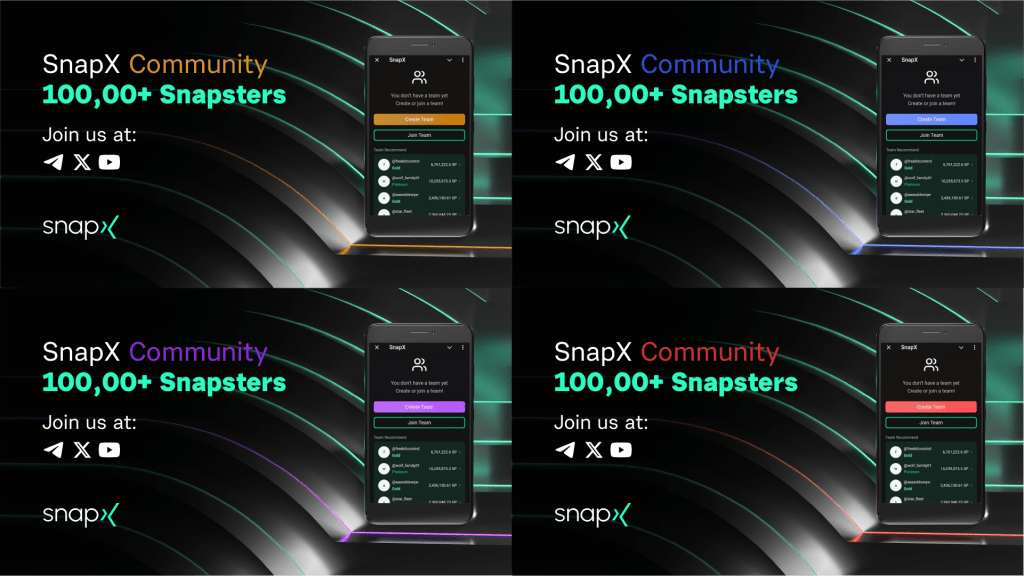
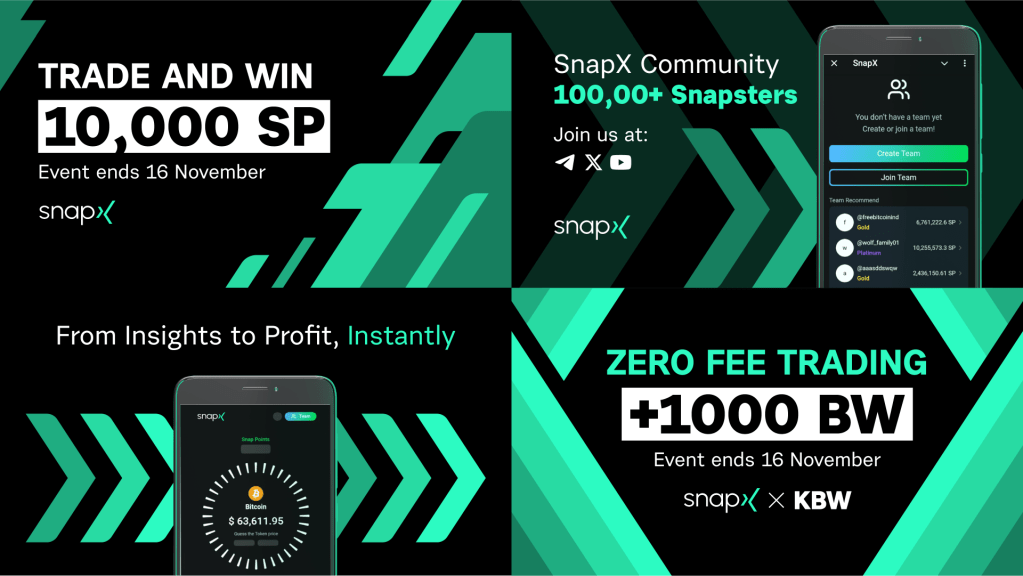
After finishing the project deck, I compiled all the vector shapes and provided the Marketing Team with a shape catalog and design templates on Canva.com to be used for their social media efforts.


Short animation
The team requested a short animation that summarizes and elaborates on the new visual branding style using the slogan, patterns, and logo.
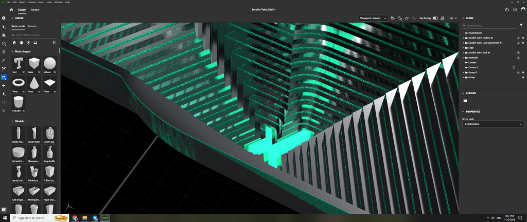
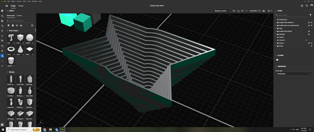
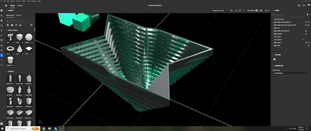
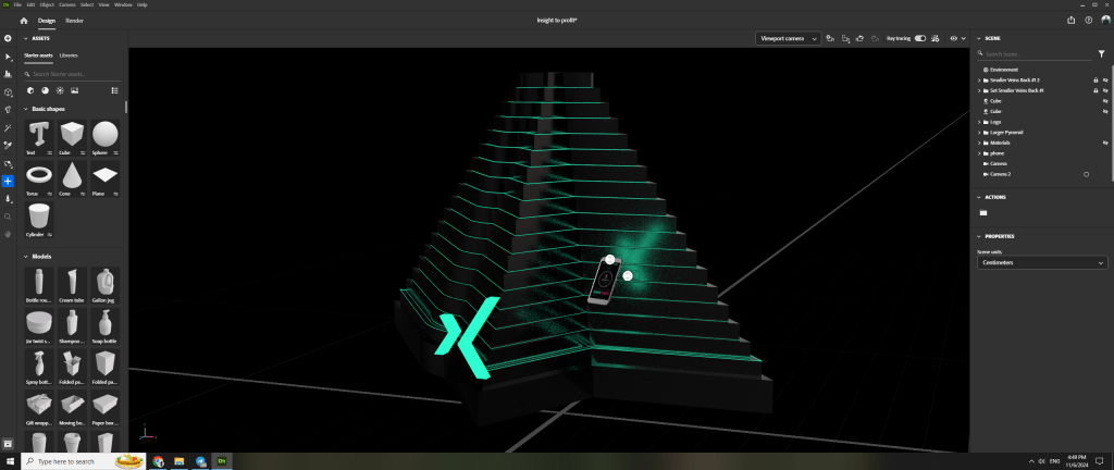
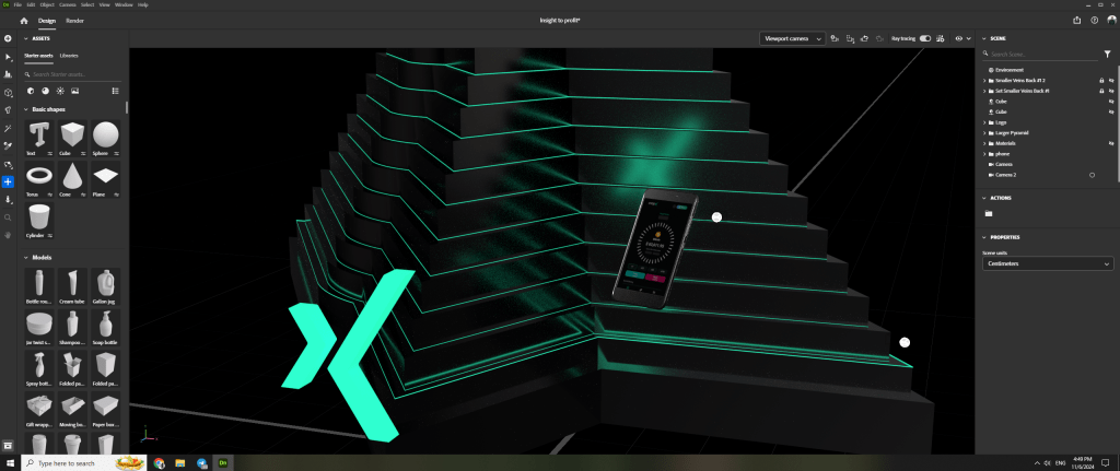
Bonus behind the scenes
The images for the second 3D style mood-board where based on one object. Using different angles, I managed to fully utilize a single object.


If you made it this far, thanks for reading! I appreciate it ^^
